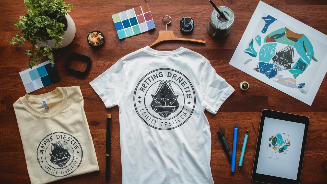
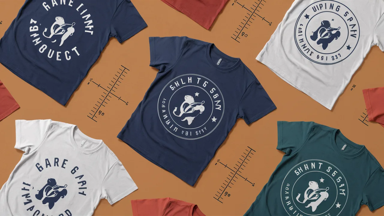
What are the biggest mistakes to avoid in custom apparel design?
Custom apparel design mistakes can destroy your profit margins and leave you with unsellable inventory. Whether you’re launching your first product line or scaling an established brand, these critical errors stem from rushing the design process, ignoring printing limitations, or misunderstanding what your customers actually want to wear. The good news? Every one of these custom apparel design mistakes is completely preventable when you know what to watch for.
TL;DR: Key Takeaways to Avoid Costly Custom Apparel Design Mistakes
- Maintain Brand Consistency: Your design should reflect your brand’s voice, colors, and identity.
- Choose Fabric Intentionally: Your design may look amazing digitally but fail on the wrong textile type.
- Keep it Simple: Intricate designs often lose detail during printing and can appear messy.
- Use a Harmonious Color Palette: Overuse of clashing colors distracts and diminishes brand appeal.
- Be Strategic About Placement: Placement can make or break the balance and wearability of apparel.
- Test Your Mockups: Real-life samples help prevent surprises post-production.
Introduction: Common Pitfalls in Custom Apparel Design
Your custom apparel represents more than fabric and ink—it’s a walking billboard for your brand. But here’s what most entrepreneurs don’t realize: the difference between apparel that sells and apparel that sits in storage often comes down to avoiding design mistakes that seem minor but have massive impact.
After helping hundreds of businesses navigate custom apparel design mistakes, we’ve identified the patterns that separate successful launches from expensive failures. From startup founders creating their first merchandise to established companies expanding their brand presence, the same apparel design mistakes appear again and again.
In this guide, you’ll discover the exact common design errors that can sink your project—and more importantly, the proven strategies to avoid them completely.

Mistake 1: Lack of Brand Consistency
Your customers should recognize your brand from across the room. Yet one of the most damaging custom apparel design mistakes is creating designs that feel disconnected from your brand identity. When your t-shirt design uses different fonts, colors, or messaging than your website and marketing materials, you’re confusing potential customers and weakening brand recognition.
Here’s what typically goes wrong: businesses see a trending design style and try to replicate it without considering whether it fits their brand personality. The result? Apparel that looks professionally designed but feels like it belongs to someone else’s company.
To maintain brand consistency and avoid this critical mistake:
- Create a brand style guide that includes approved fonts, colors, and design elements
- Ensure your apparel designs use the same visual language as your digital presence
- Incorporate your logo or signature brand elements subtly but recognizably
- Test new designs alongside your existing marketing materials to check for cohesion
When your apparel feels authentically connected to your brand, customers become walking advertisements who are proud to represent your company.
Mistake 2: Ignoring Fabric Choices
You’ve spent hours perfecting your design on screen, but will it actually work on the fabric you’ve chosen? This disconnect between digital design and physical reality causes some of the most expensive apparel design mistakes we see. Different fabrics interact with inks and printing methods in dramatically different ways, and the wrong choice can make your carefully crafted design look amateur.
Understanding fabric behavior is crucial for successful custom apparel design:
- 100% cotton provides excellent ink absorption and vibrant colors but may shrink after washing
- Polyester blends offer durability and shape retention but may require different printing methods
- Tri-blends create a premium feel and drape beautifully but can mute bright colors
Smart fabric selection strategies:
- Define your priorities first—comfort, durability, or fashion appeal?
- Consult with your printer about fabric compatibility before finalizing designs
- Request fabric samples and test prints to see how your design performs on actual materials
The right fabric choice transforms your vision into apparel people actually want to wear repeatedly.
Mistake 3: Overcomplicating Design Elements
More isn’t always better in custom apparel design. One of the most common design errors is cramming too many elements, fonts, or colors into a single design. While complexity might seem impressive on your computer screen, it often translates to cluttered, unreadable, and unprofessional-looking apparel that customers avoid.
Overcomplication creates multiple problems: printing becomes more expensive, design elements compete for attention, and the core message gets lost. Your apparel should communicate its purpose within seconds, not require careful study to understand.
Design simplification strategies that work:
- Limit yourself to 1-2 complementary fonts per design maximum
- Use white space strategically to guide the eye to your most important elements
- Create clear visual hierarchy where the largest elements communicate your primary message
- Remember that apparel is viewed from various distances—your design should work from both close up and far away
The most memorable apparel designs are often the simplest ones that communicate one clear, powerful message.
Mistake 4: Poor Color Palettes
Color choices can make or break your custom apparel design. What looks vibrant on your monitor might appear dull on fabric, and color combinations that seem trendy online can look cheap or unprofessional in real life. Poor color decisions are among the most avoidable apparel design mistakes, yet they continue to derail projects.
Color challenges in apparel design include screen-to-fabric color shifts, readability issues, and brand alignment problems. Additionally, some color combinations simply don’t work well together, creating visual discord that makes your apparel less appealing to potential customers.
Professional color selection approach:
- Test color combinations under multiple lighting conditions—natural sunlight, indoor lighting, and fluorescent
- Use Pantone Matching System (PMS) colors for consistent, professional results
- Limit your palette to 2-3 main colors plus neutrals to avoid visual chaos
- Ensure sufficient contrast between text and background colors for readability
Remember that colors carry emotional weight—choose colors that reinforce your brand message and appeal to your target audience’s preferences.

Mistake 5: Not Considering Print Placement
Print placement affects everything from visual appeal to wearing comfort, yet it’s one of the most overlooked aspects of custom apparel design. A design that looks perfect in one location can appear awkward, unbalanced, or even unwearable when placed incorrectly on the garment.
Poor placement decisions often stem from not considering how the apparel will look and feel when actually worn. What works on a flat mockup might not work on a moving body, and different garment styles require different placement strategies to look professional.
Strategic placement guidelines for different areas:
- Chest Prints: Position 3-4 inches below the collar line for optimal balance and visibility
- Back Prints: Perfect for bold graphics, event information, or detailed designs
- Sleeve Prints: Trending in streetwear, adds subtle branding without overwhelming the design
- Hem or Hip Placements: Excellent for minimalist branding and fashion-forward designs
Always test your placement decisions using realistic mockups that show how the design will look on actual bodies in motion, not just flat product photos.
Cost Guide: Apparel Design & Printing in Singapore
| Cost Tier | T-shirt + Design (per unit) | Suitable For |
|---|---|---|
| Low-End | $7 – $12 SGD | Bulk orders, basic branding |
| Mid-Range | $13 – $20 SGD | Custom shirts with color prints |
| High-End | $21 – $35+ SGD | Fashion lines, specialty inks |
Conclusion: Master Custom Apparel Design That Sells
Success in custom apparel design comes down to understanding that every decision—from color selection to fabric choice—impacts both the final product quality and customer appeal. By avoiding design mistakes like poor brand consistency, fabric mismatches, and overcomplicated layouts, you set your apparel up for market success.
The most successful custom apparel follows the “3-second rule”—someone should understand your message and feel drawn to your design within three seconds of seeing it. If your design requires explanation or careful examination, it’s time to simplify and refocus on what matters most to your target audience.
Remember: your custom apparel isn’t just clothing—it’s a marketing tool, brand ambassador, and revenue generator all in one. Invest the time to get these fundamentals right, and your apparel will work harder for your business.
Frequently Asked Questions
- Is $25 too much for a custom shirt?
Not if it reflects high-quality fabric, durable prints, and strong brand alignment. $25 falls well within the acceptable range for fashion-oriented or specialty prints. - What fabric is best for printed t-shirts?
100% cotton is ideal for soft prints. Tri-blends are trendy and drape well but may mute bright colors. - How do I know if my design prints well?
Request digital mockups and conduct small test runs on actual garments before full production. - Can I use more than five colors?
Yes, but it increases cost and risk of clashing. Use color wisely. - Is screen printing better than DTG?
Screen printing is cost-effective for bulk. DTG excels with complex or small batch prints. - Do placement templates exist?
Yes. Many design platforms or printers offer garment mockup templates for standard placements. - How many fonts should I use?
Two is ideal. One for headers, another for body or slogans. Simplicity keeps it professional.
