What are the essential t-shirt design rules I need to follow?
To create effective, high-quality t-shirt designs that grab attention and withstand trends, you need to follow these 7 proven t-shirt design rules: master design fundamentals like color theory and typography, prioritize originality over imitation, avoid visual clutter, understand your target audience, and apply strategic scaling and placement for graphics. Combined with smart inspiration techniques, these essential rules create the foundation for standout t-shirt design that connects with customers and drives sales.
TL;DR Summary
- Design Basics Matter: Color theory and font pairing aren’t optional—they’re vital for harmony and readability.
- Be Original, Stay Relevant: Aim to innovate instead of copy—it strengthens your brand and attracts loyal fans.
- Avoid Design Clutter: Less is usually more. A clear focal point creates visual impact without overwhelm.
- Think Consumer-First: Who you design for impacts the tone, color scheme, and layout choices.
- Graphics Are Key: Use high-quality illustrations with thoughtful scaling and placement.
- Inspiration Helps: Creative blocks happen—knowing how to break past them keeps ideas flowing.
1. Understanding T-Shirt Design Principles: The Basics You Need to Know
1.1 Color Theory and Palette Selection

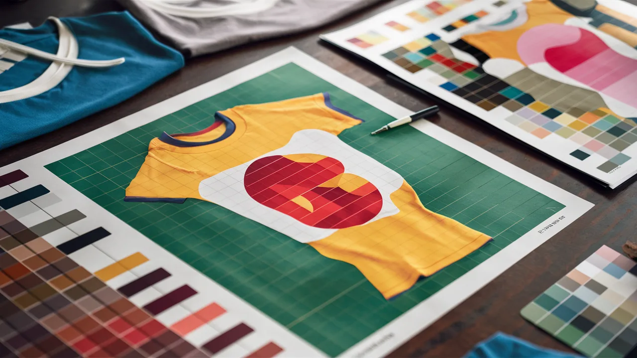
Ever wonder why some t-shirt designs just *pop*, while others fall flat? It’s almost always about strategic color choices. Color theory sets the emotional tone and overall cohesion of your t-shirt design. Warm hues like red and orange tend to energize and create excitement, while cool tones like blues and greens promote calm and trust. But effective t-shirt design tips go beyond just color choice—contrast is everything. A neon yellow tee with white text? Practically invisible. Instead, think complementary colors or high-contrast schemes for instant legibility and maximum visual impact.
Pro tip: Use tools like Adobe Color or Coolors to test color palettes before you commit. Also, remember that printing methods and fabric type may slightly alter color hues—always know your printing medium for the best results!
1.2 Typography and Font Usage
Typography isn’t just choosing a font—it’s crafting your message’s voice and personality. Fonts communicate emotions before people even read the words. A distressed typeface tells a completely different story than a sleek sans-serif. For successful t-shirt designs, bold, readable fonts typically work best. But resist the urge to go font-crazy—stick to 1–2 font families maximum to maintain visual harmony and avoid design chaos.
Essential typography tips for effective t-shirt design:
- Ensure text creates strong contrast with the shirt color for maximum readability.
- Perfect your spacing (kerning) for balanced, professional-looking text—no crowded lines!
- Use outlines or subtle shadows to make words pop against textured backgrounds.
2. The Dos of Creating a Standout T-Shirt Design
2.1 Originality and Creativity
If you’ve seen your t-shirt design idea before, chances are your customers have too. Originality separates a forgettable tee from a viral sensation that people actually want to wear. Draw inspiration from everywhere—but never copy directly. Look to urban culture, street art, vintage posters, nature, or even poetry. Start with rough sketches; even messy doodles can evolve into brilliant, standout t-shirt designs.
In practice, we’ve seen the best-selling shirts emerge from weird, unexpected ideas that completely break conventional molds. Maybe it’s a quirky phrase twisted with surreal illustration—whatever direction you choose, make it authentically yours. Unique visuals spark conversations, and conversation-starters are exactly what you want your customers wearing.
2.2 Embracing Trends Without Being Cliché
Staying aware of current design trends (like retro typography or minimal line art) is smart business—but blindly following every trend? That’s risky territory. Why? Trends fade fast, but great t-shirt design endures. The secret is to *acknowledge* trends without becoming a cliché copy.
Example: Instead of blindly copying ‘Y2K aesthetics’, interpret the trend through your unique style lens—perhaps via custom pastel gradients or reimagined nostalgic icons. That’s how trend-aware designers stay current *and* maintain their original creative voice.
3. Common Mistakes to Avoid When Designing T-Shirts
3.1 Overcrowding and Clutter
Here’s what happens to even experienced designers—excitement takes over and they cram everything onto one canvas: bold text, multiple graphics, fancy border effects, and busy background images. The result? Complete visual overload and one of the most common t-shirt design mistakes. Too much detail renders a tee illegible from even a short distance, defeating the entire purpose.
Instead, focus on one central message or hero image. Think big, think bold—your effective t-shirt design needs to communicate its core message in 5 seconds or less. Remember: white space is your friend, not your enemy.
3.2 Ignoring the Target Audience
Designing for ‘everyone’ means you’re actually designing for no one—a critical mistake that kills sales potential. Want to connect with Gen Z customers? They gravitate toward irony, pop culture mashups, and wearable memes. Targeting fitness enthusiasts? Clean, powerful typography and performance-inspired motifs resonate much better.
Pro tip for standout t-shirt designs: Build detailed design personas for your target audience. Give them names, picture their lifestyle, habits, even their Spotify playlists. This strategic approach brings your t-shirt designs into real-world alignment with actual customer desires.
4. Incorporating Graphics and Illustrations Effectively
4.1 Scaling and Placement Techniques

Even the most brilliant illustration fails if it’s poorly executed on the actual shirt. Whether you’re placing a fierce dragon across a black tee or arranging abstract geometric shapes, strategic scaling and placement make the difference between amateur and professional results. Too large and the graphic overwhelms the wearer. Too small and your message gets completely lost.
Master these placement strategies for effective t-shirt design:
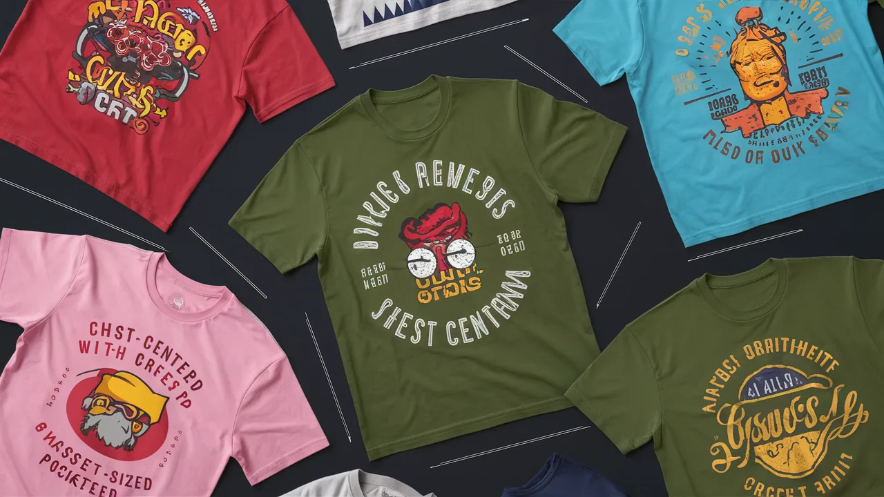
- Chest-Centered: Classic and universally versatile. Perfect for impactful quotes and symbolic designs.
- Pocket Print: Minimal, trendy, and sophisticated. Ideal for witty logos and subtle branding.
- All-Over Print: Demands boldness and design confidence. Best for abstract patterns or immersive artwork.
5. Finding Inspiration: Tips for Overcoming Creative Blocks
Every creative professional hits inspiration walls—there’s absolutely no shame in that reality. What separates hobbyists from successful t-shirt designers is how quickly and effectively they bounce back from creative blocks.
Here are proven strategies we use when ideas run dry:
- Embrace creative limitations: Restrict yourself to just two colors or one subject matter. Constraints force innovative solutions and breakthrough ideas.
- Seek offline inspiration: Museums, street art, vintage shops, nature walks—they offer textures, stories, and perspectives that algorithms simply can’t provide.
- Curate your digital inspiration: Build focused inspiration boards on Pinterest or Behance—but resist falling into comparison traps that kill creativity.
- Try design challenges: 30-day design sprints or prompt-based creative journals build both consistency and inject fun back into the process.
Cost Guide: T-Shirt Design Price Ranges in Singapore
| Design Type | Low-End (SGD) | Mid-Range (SGD) | High-End (SGD) |
|---|---|---|---|
| Basic Text Design | $10 – $20 | $20 – $35 | $35 – $60 |
| Custom Graphics (1–2 colors) | $15 – $25 | $30 – $50 | $60 – $100 |
| Illustrative/All-over Print | $25 – $45 | $50 – $75 | $80 – $150+ |
Final Thoughts: Build T-Shirts That People Actually Want to Wear
Mastering t-shirt design rules combines artistic creativity with strategic thinking. Stick to proven design fundamentals, be fearless with your unique voice, and always consider the real person who’ll wear your creation. T-shirt design represents wearable self-expression—it deserves thoughtful consideration and authentic creativity. Whether you’re building a business or designing for personal fulfillment, stay curious, edit ruthlessly, and design with genuine courage. These effective t-shirt design tips will help you create standout pieces that people genuinely want to own and wear.
Frequently Asked Questions
How do I make sure my t-shirt designs are original?
Start with personal ideas and life experiences—don’t rely on copying existing designs. Sketch often, and remix influences uniquely.
What’s the ideal print size for a standard unisex tee?
For chest prints, aim for 10–12 inches wide by 12–14 inches tall. Adjust based on garment size and style.
How many colors should I use in a design?
2–4 colors is a good sweet spot for aesthetic balance and cost-effectiveness, especially in screen printing.
How to make a t-shirt look worn?
Use soft-wash cotton, choose distressed fonts and faded ink colors, and consider stone-washed or vintage blend fabric for that retro vibe.
Can I use free fonts in t-shirt designs?
Yes, but always check licensing. Some “free” fonts are only free for personal use, not for commercial printing.
