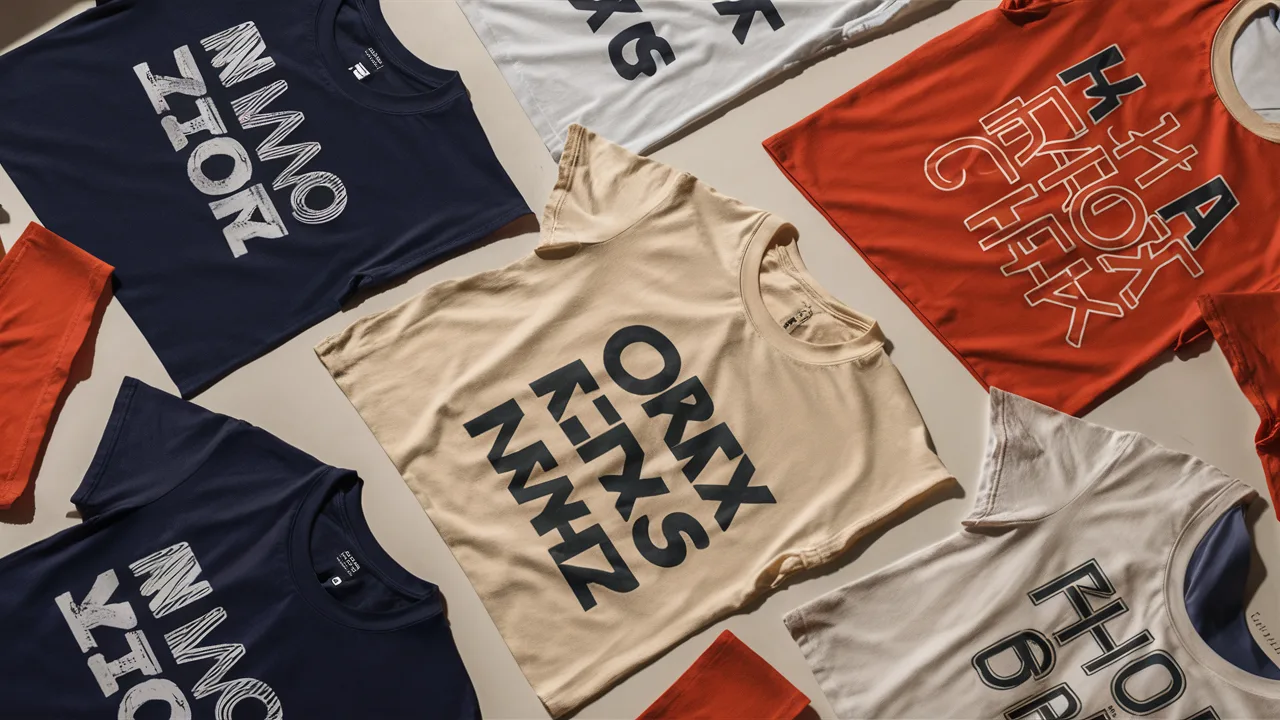
What are the best T-shirt color combinations, and how do you choose them?
The best t-shirt color combinations merge strategic design thinking with emotional impact. Choosing effective color pairings isn’t just about visual appeal—it’s about creating mood, conveying your message, and establishing meaningful contrast. Whether you want to project sophistication, energy, or bold identity, mastering color theory and understanding current fashion trends is crucial for success.
- ✅ Strategic color contrast: High-contrast combinations make text and graphics pop instantly.
- 🎨 Trending color palettes: Current favorites include earthy tones, soft pastels, and bold retro combinations.
- 🧠 Color psychology principles: Colors trigger emotional responses—leverage this in your designs.
- 👕 Real-world examples: See how professional designers apply color theory to actual garments.
- 🚀 Brand-building strategies: Learn how to create distinctive palettes that build recognition.
Choose Your Palette: The Psychology of T-Shirt Colors
Color Contrast and Combination Theory

Effective color contrast combines science with storytelling. In t-shirt printing and clothing design, color theory uses the color wheel to guide strategic pairings. Complementary colors (opposites like red and green) create high energy and visual impact, while analogous colors (neighbors like blue and turquoise) offer harmony and sophistication. Your choice depends on your design goals and target audience.
For bold graphic t-shirts targeting urban markets, try high-contrast combinations like black with neon green, or crisp white on deep red. For minimalist, premium designs, subtle contrasts work beautifully: soft beige with ivory, or slate blue paired with charcoal gray. The key is balancing visual impact with design intent.
Trending T-Shirt Color Schemes
Fashion psychology shows consumers gravitate toward colors with emotional resonance. After years of stark minimalism, we’re seeing a shift toward expressive and nostalgic color palettes. Here are today’s standout combinations:
| Color Theme | Primary Colors | Psychological Impact |
|---|---|---|
| Soft Pastel Revival | Lavender, sage green, powder blue | Calm, approachable, optimistic |
| Earthy Naturals | Terracotta, moss green, warm sienna | Grounded, sustainable, authentic |
| Bold Retro Flash | Hot pink, electric blue, golden mustard | Confident, nostalgic, energetic |
| Tech Minimalism | Charcoal, cool gray, accent teal | Modern, professional, sleek |
When selecting t-shirt color combinations, treat your palette as the emotional foundation of your message. Whether you’re creating custom prints or launching an apparel line, these trending combinations help you connect with current consumer preferences and aesthetic sensibilities.
Designing for Impact: Best Practices in T-Shirt Color Combinations
Expert Tips for Professional Results
Successful t-shirt printing starts with strategic color planning. Here are proven practices that deliver both style and commercial success:
- Maximize readability contrast: For text-heavy designs, use opposing values—white text on navy backgrounds consistently outperforms low-contrast combinations.
- Create visual texture: Simulate materials like denim or vintage effects using layered tones—try ash gray graphics on faded blue shirts.
- Match brand personality: Fitness brands thrive with energetic orange and black combinations, while wellness brands benefit from calming sage, mint, or natural linen tones.
- Balance saturation levels: Avoid competing bright colors—pair saturated graphics with muted shirt bases, or vice versa.
Remember: color communicates your message before text ever does. Professional t-shirt printing relies on color harmony as a fundamental design requirement, not an afterthought.
Real-World Color Combination Examples
These proven t-shirt color combinations consistently perform well in retail and online markets:
- Classic Athletic: White shirt + bold red lettering = timeless sports appeal
- Urban Edge: Burnt orange tee + black minimalist graphics = street-style sophistication
- Eco-Conscious: Sage green base + cream typography = sustainable, modern aesthetic
- Premium Casual: Deep black tee + metallic gold accents = elevated everyday wear
Whether you prefer statement graphics or subtle branding, strategic color contrast in clothing design is what elevates your work above the competition in today’s crowded apparel market.
Making Your Brand Stand Out: Unique Color Palettes for Small Businesses
Building Visual Identity Through Color
Your brand identity extends far beyond logos—it’s an emotional experience that starts with color. Consistent t-shirt color combinations can embed your brand in customer memory and build recognition. Here’s how small businesses can develop powerful color strategies:
- Select an anchor base: Choose your signature shirt color—slate, cream, or khaki work for most brands
- Define your accent color: Pick one standout hue for logos, text, or graphic elements
- Establish emotional tone: Decide what customers should feel—energized, trusted, inspired, or relaxed
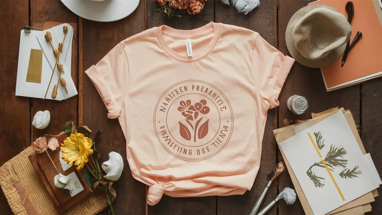
For example, a plant-care brand might choose sage green shirts with warm peach accents for a nurturing, growth-focused vibe. A streetwear label could use charcoal bases with electric blue graphics for urban sophistication.
Personalizing Your T-Shirt Designs

Modern t-shirt printing techniques—including DTG, screen printing, and heat transfer—offer incredible color fidelity for custom designs. Here’s where personalization creates real value:
- Use meaningful colors that connect with team spirit, school pride, or community identity.
- Create cohesive palettes that complement existing brand photography, packaging, or marketing materials.
- Offer versatile options with gender-neutral tones and seasonal color variations.
The result is clear: increased personalization drives higher customer engagement. When people feel represented by your color choices, they connect more deeply with your designs.
T-Shirt Printing Cost Guide in Singapore
| Price Tier | Expected Cost (Per Shirt) | Ideal For |
|---|---|---|
| Low-End | $8 – $15 | Event giveaways, simple logos |
| Mid-Range | $16 – $30 | Startups, merch drops |
| High-End | $31 – $60+ | Fashion brands, limited editions |
Final Thought: The Power of Color in Your Hands
T-shirt color combinations are powerful tools for communication, emotion, and brand building. Whether you’re designing your first custom tee or refining your apparel strategy, invest time in understanding color theory, testing contrast combinations, and considering psychological impact. With the right color palette, your designs don’t just look good—they tell compelling stories that resonate with your audience.
Frequently Asked Questions
- Which color is best for T-shirt printing?
It depends on design contrast and printing method. White offers versatility, while black is ideal for bright or metallic prints. Neutral bases like heather gray or beige suit many aesthetics. - How many colors should I use in a T-shirt design?
Stick to 2–3 colors for clarity and cost-efficiency. Overuse can complicate printing and overwhelm the message. - Can color combinations affect sales?
Absolutely. Strategic palettes increase appeal, brand recall, and emotional connection—key factors in consumer choice. - How do I know a color combo works?
Test digitally and physically under different lighting. Trust contrast and alignment with your brand’s tone. - Is pastel still trendy for adults?
Yes! Pastels like sage and lilac are modern mainstays when paired with structured fonts or minimalist shapes. - Can I do trendy palettes and still stay brand-consistent?
Yes—choose one trend element (like a pop color) while keeping your core palette intact. - Do certain color pairings work better for different age groups?
Yes. Bold neon combos often appeal to younger groups, while muted or vintage tones attract adult demographics.
{“@context”:”https://schema.org”,”@type”:”BlogPosting”,”headline”:”2022 Trends: Unleash the Power of T-Shirt Color Combinations”,”description”:”Discover expert tips on T-shirt color combinations, color psychology, and trendy palettes to boost fashion and branding in 2022.”,”datePublished”:”2024-06-05″,”publisher”:{“@type”:”Organization”,”name”:”Print on Demand Singapore”,”logo”:{“@type”:”ImageObject”,”url”:”https://printondemand.sg/wp-content/uploads/singapore-custom-shirt-print-on-demand-logo-300×51.png”}},”mainEntityOfPage”:{“@type”:”WebPage”,”@id”:”https://printondemand.sg/”},”keywords”:[“T-shirt printing”,”color contrast”,”fashion”,”graphic design”,”clothing design”,”T-shirt printing techniques”,”color theory in design”,”apparel color trends”],”mainEntity”:[{“@type”:”Question”,”name”:”Which color is best for t-shirt printing?”,”acceptedAnswer”:{“@type”:”Answer”,”text”:”It depends on design contrast and printing method. White offers versatility, while black is ideal for bright or metallic prints. Neutral bases like heather gray or beige suit many styles.”}},{“@type”:”Question”,”name”:”How do I know a color combo works?”,”acceptedAnswer”:{“@type”:”Answer”,”text”:”Test your design both digitally and with print samples. Look at the contrast, viewer response, and whether the colors align with your brand’s tone and audience.”}},{“@type”:”Question”,”name”:”Can color combinations affect t-shirt sales?”,”acceptedAnswer”:{“@type”:”Answer”,”text”:”Yes. Strategic, emotionally resonant palettes improve visual appeal and increase the likelihood of product engagement and purchase.”}}]}
